Utilizing Visual Signs and Schedules At Your Play Cafe or Indoor Playground Business

It’s April and that means it’s Autism awareness month! And while I already have an entire 5-episode series on better accommodating autistic kids and adults at your indoor playgrounds you can find beginning with episode 93 of the Profitable Play Podcast, there are a few more things I think are important to share, especially things I have noticed as I have been traveling a lot this year visiting different facilities and seeing even more of what works and what does not work.
And one thing I mentioned in one of those 5 episodes but wanted to expand on here is the importance of visual schedules and signage.
Visual signs and schedules are tools that use images, symbols, and/or words to provide information and instructions in a visual format. They are commonly used in various settings, including indoor playgrounds, to help individuals with communication difficulties or cognitive disabilities understand their surroundings and what is expected of them.
And if you accommodate children that are under 5 or 6 years old– remember, they can’t yet read. So even if they do not have any disabilities, visual signs can help them follow the rules and behave safely in your space and it can help prevent tantrums and meltdowns in all kiddos.
Visual signage typically includes images and/or words to convey information, while visual schedules provide a visual representation of a sequence of events or activities.
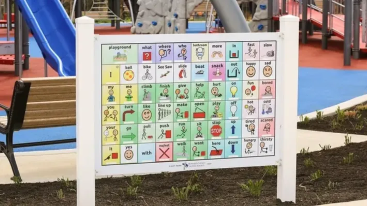
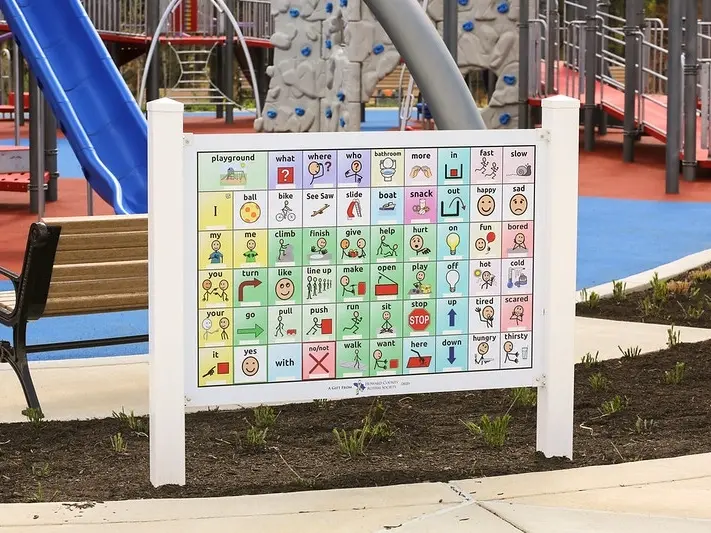
(PICTURE: An example of a communication board designed by shanesinspiration.org and shared with us by Play Maker Society member Katrina G.!)
Visual schedules and signs are essential for inclusivity at an indoor playground. These tools provide children with a clear understanding of what to expect, where to go, and what to do while at the playground.
To give you an example, I was at an indoor playground earlier this year and I was consulting with the owner and one of the things she was struggling the most with was keeping big kids out of her baby area. And she had no gate or divider to separate the space, which was an issue in and of itself, but that wasn’t easy to remedy. She then pointed to the sign that stated “babies under 1 ONLY” in giant, black bold letters. She said, “Michele, I just don’t understand how I can make it any clearer”.
But one of the things she forgot is that 90% of the kiddos that visited her space couldn’t read yet. And when I looked at her website, her play cafe was marketed as one of those spaces where parents are supposed to relax and sip their coffee while their little ones play. So parents aren’t hovering around constantly here, helping their children navigate the space.
So her longer term fix is of course to put a boundary or gate up, but in the short term, I suggested she create a visual sign showing a small crawling baby just as prominently as she displayed the text. Within a few days her staff saw a huge improvement in the amount of tantrums and meltdowns that resulted from them removing the larger kiddos from that baby area. Why? Much of the time, tantrums occur when children are confused as to why they can’t have what it is that they want. By giving the staff this tool of a visual sign to point to while they explained that the area is only for babies, it helped them to enforce the rules more easily and without as many issues. And I have seen this example play out SO often–
So let’s talk about why visual schedules and signs are important for inclusivity at an indoor playground- for ALL guests. Then, I will give you some ideas about how you can implement this and where you should be using these tools in your business.
So, to recap on that example, why are visuals important in your signage?
1) Provides Structure and Predictability
Visual schedules and signs provide children with a clear understanding of what to expect, where to go, and what to do while at the indoor playground. This provides structure and predictability, which can be especially helpful for children with autism or other neuro-developmental disorders. When children know what to expect, they are more likely to feel comfortable and confident, reducing anxiety and potential tantrums.
2) Enhances Communication
Visual schedules and signs are a helpful tool to enhance communication, especially for children who struggle with verbal communication or have limited language abilities– whether it’s due to neurodivergence or simply age. By using pictures and symbols, children can better understand and communicate their needs and preferences, reducing frustration and misunderstandings.
For example, when my non-speaking son is struggling to communicate a want or a need, I have an app on my phone with a bunch of simple symbols. For example there is a toilet, a juice box, a car signaling he’s like to leave, etc.
And while this tool is personal to us, you can create similar communication boards in your indoor playground facility. Whether it’s a display of symbols on a wall or a laminated sheet you offer to parents who are struggling with their young child, again, we can use these visuals to enhance ALL of our guests' experiences– by facilitating communication and reducing meltdowns.
3) Promotes Independence
Visual schedules and signs can also promote independence for children at an indoor playground. By providing clear directions and instructions, children can navigate the playground and engage in play activities without constant adult supervision. This can help build confidence and independence, which is essential for social and emotional development.

4) Increases Safety
Visual schedules and signs can also help increase safety at your facility. By providing clear directions and instructions, children are more likely to follow safety rules and guidelines, reducing the risk of accidents and injuries. For example, a sign indicating that shoes must be worn in certain areas can prevent slip-and-fall accidents, and a similar sign indicating where socks must be worn can help keep your space clean and contaminant free.
You can share a visual for all of your rules, such as no running, no hitting, no food in the play area, etc. Again, whether you have these symbols constantly displayed or simply equip your staff with a visual aid when an issue arises, implementing this can help both parties and open play run more smoothly for staff, guests, and parents alike.
5) Supports Inclusion
As I mentioned, visual schedules and signs can also support inclusion at an indoor playground by providing a universal tool that can be easily understood by all children, regardless of language or cognitive abilities. By providing clear directions and instructions, children can engage in play activities alongside their peers, reducing the potential for exclusion or isolation.
I always prefer a mixed medium sign– with BOTH images and text to cater to both parents and children regardless of reading level. You should also seek to include braille or sound for guests with limited vision on all important signage as well.
6) Reduces Stress and Anxiety
For children with autism or other neurodevelopmental disorders, or just toddlers who are getting used to rules and routines, visual schedules and signs can reduce stress and anxiety.
By providing clear directions and instructions, children can better understand their surroundings, reducing the potential for sensory overload or unexpected events. This can help children feel more comfortable and confident, leading to a more positive and enjoyable play experience.
This also helps reduce the stress and anxiety of adult guests as well. For example, if I were to bring my son to a birthday party, he would want cake right away. If the facility has a visual schedule of the day’s events, I can more easily explain to him that FIRST we play, then we get pizza, then we eat cake. Being able to both verbally and visually explain this to him would increase his chances of being able to enjoy the party alongside his peers.
So I gave a few examples already, but here’s a list of areas in your indoor playground facility where you may want to include visual signage
- Rules and Guidelines: Signs that display important rules and guidelines such as no shoes allowed, no food or drink allowed on equipment, and a maximum height limit for children.
-
Wayfinding: Signs that provide directions and guidance to navigate around the indoor playground, such as signs that direct visitors to the play area, restrooms, or a designated quiet area. I gave an example of this in my recent vlog showing the Explore and More Children’s museum. They had one specific gross motor structure that had a designated entrance and exit. While my child still struggled and cried when he couldn’t enter the exit, the arrows across the structure greatly reduced the time he spent upset and allowed me to eventually help him understand the process, and he recovered really quickly after I pointed out the signs. The goal here will never be to limit tantrums or meltdowns, but rather give staff, kiddos, and caregivers alike the tools they need to safely enjoy your space and reduce communication frustrations wherever necessary.
-
Activity Schedule: A visual schedule that displays the sequence of activities available at the indoor playground, whether it be during open play so for getting ready to go into the play area, during an event, during a class, or during a party. In episode 186 Bryson spoke to us about creating an effective and inclusive music program for our spaces, and if you recall one of the suggestions he gave for enhancing the flow of the class was to have a visual schedule and communicate it to parents before the class, at the beginning of the class, and throughout the class.
-
Safety Tips: Signs that provide important safety tips, such as how to properly use equipment, how to handle emergencies, and the location of the first-aid kit. If there are any places kiddos and guests can’t go like a back office, utilizing visuals can help here as well.
-
Cleanliness Tips: If kids must wash hands or sanitize, using a picture or a visual process can assist parents in ensuring all of these tasks are completed. If there is a yuck bucket or mouthed toys bin, I always recommend a big X or a picture of a germ so kids know it’s not just a bucket of toys they can grab and play with.
-
Sensory-Friendly Areas: Signs that indicate designated quiet areas or sensory-friendly spaces, such as a low-light area or a room with soft music
-
Food and Beverage Options: A visual menu that displays food and beverage options available at the indoor playground, including allergy-friendly options. We had this and I will share an example on my instagram stories so be sure to follow me there. This tool helped kiddos of all abilities communicate their needs and utilize their independence in our facility
-
Check-In Procedures: Signs that display check-in procedures, such as where to sign in, where to leave personal belongings, and how to receive a wristband for entry.
-
Staffing Information: Signs that provide information about staff members, such as their names and photographs, and how to ask for assistance.
-
Emergency Evacuation Plan: A sign that displays the emergency evacuation plan, including the location of emergency exits and where to gather outside in case of an emergency.
Your play of the day is to implement at least one of these visual signs or schedules THIS week.
I gave you ten ideas, so message me and let me know on instagram which one you have already implemented or plan to implement. I am putting together a youtube video on using these types of signs and I would LOVE to feature yours! So message me a picture and also let me know if I missed any clever places to utilize visual signs or schedules- I’d love to know!


